Ranking the 2020 Major League Soccer Jerseys
All photos courtesy of MLSsoccer.com
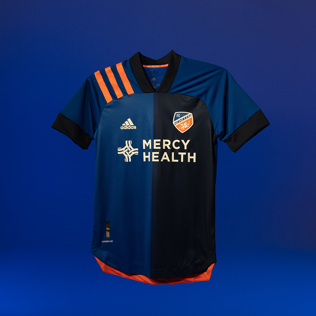
26. FC Cincinnati
What….why….if they had just gone with the lighter blue, sure it would have been boring but it would have looked nicer. The shoulders both being lighter but half the front being darker, it just doesn’t look very good. It could have also used more orange. At least the away kit is nice.
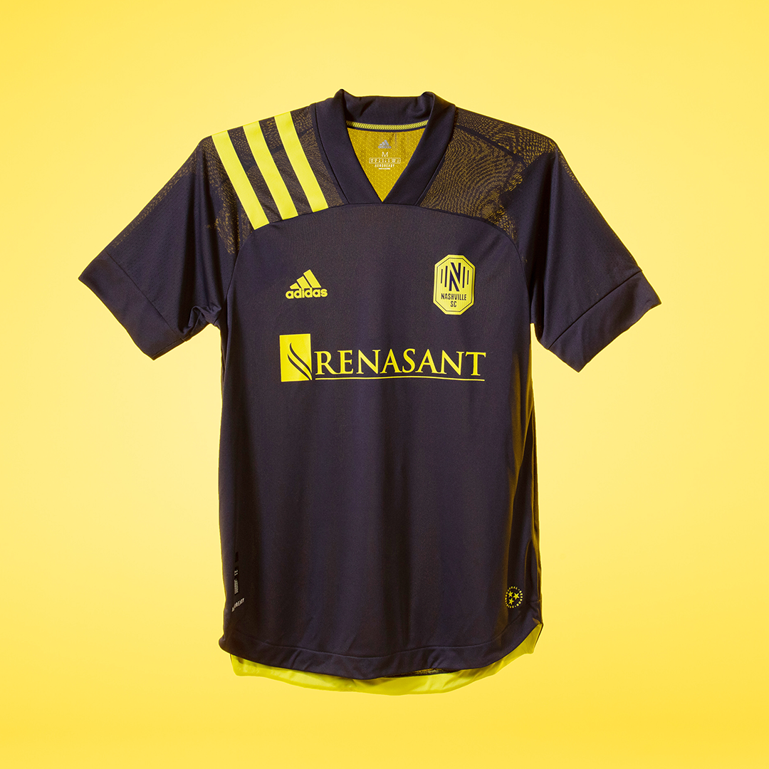
25. Nashville SC
Things are not off to a great start in Nashville, which includes little to no thought being put into their uniforms. Home shirt? All yellow, no pattern, blue stripes on shoulder. Away shirt? The exact same thing reversed, but with the 25th anniversary stripes instead. New clubs should want to make a splash. This doesn’t even make a ripple.

24. Philadelphia Union
Apparently there is a snake pattern on this shirt. That would be great if you could see it! It’s the difference between it being unique and being the most boring kit in the league. If you’re going to do something cool, do it right. And where’s the classic gold stripe? Bring back the centered Adidas logo, too.

23. Columbus Crew
I kind of like the design...but you’re just stuck staring at that line it makes at the shoulders. Also, with no sponsor, there’s just no looking away from the asymmetry of the design which doesn’t continue on to the back. I like the Ohio detail on the back collar and the yellow numbers are awesome, but this jersey needs some continuity. It’s too bad because black and yellow are such a good combo.

22. Houston Dynamo
This is a training kit disguised a jersey. It’s a cool look, but there’s just a lot going on. Like Columbus, the line between the front and the shoulders causes problems. The orange in the shoulder stripes also doesn’t appear to match the orange in the design. I love the Texas flag detail, but simpler would have been better. Another poor use of great colors.
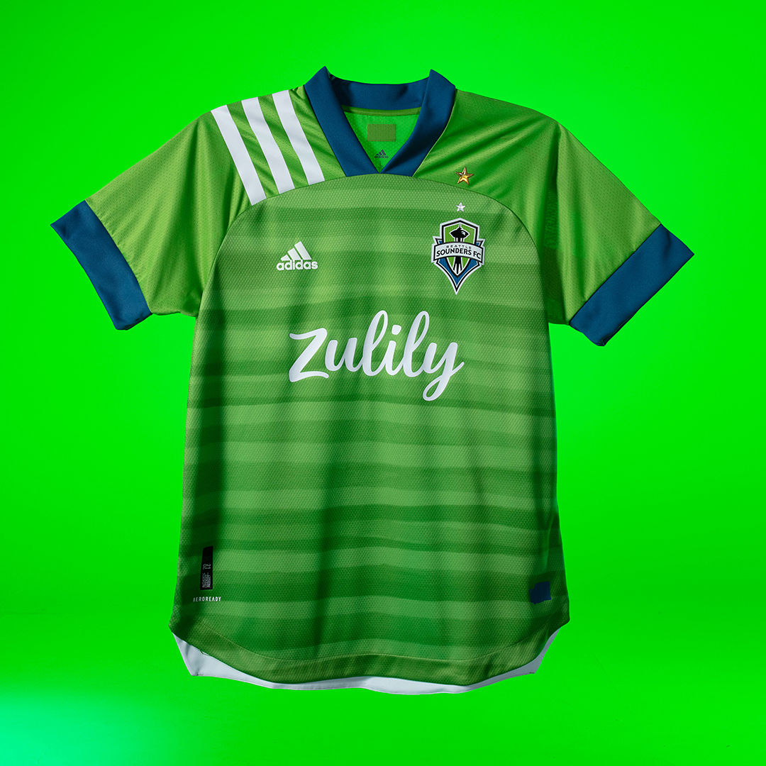
21. Seattle Sounders
Historically, they’ve had some of the best kits because it’s hard to mess up these colors (especially back when they had the X-box sponsorship). That said, what the hell is going on here? Am I eating a cucumber? It’s as if they put a big sticker on the front of a different Sounders shirt. Weird wavy stripes + shoulder stripes = nope. Not a kit befitting of defending champions. The gold star is cool, but why is it stacked on top of the other one?

20. Inter Miami
I want to evaluate this kit on its own without comparing it to the away kit, which is literally a white t-shirt. Black and pink offers phenomenal opportunity, and they didn’t take advantage here. The subtle flamingos are a cool idea, but maybe they could have been pink (see the famous Forward Madison pink keeper kit, but in reverse). No sponsor and an inability to see the flamingos from more than a couple inches away make this just boring. It wouldn’t be so bad if this club didn’t have soooo much hype around everything it did.
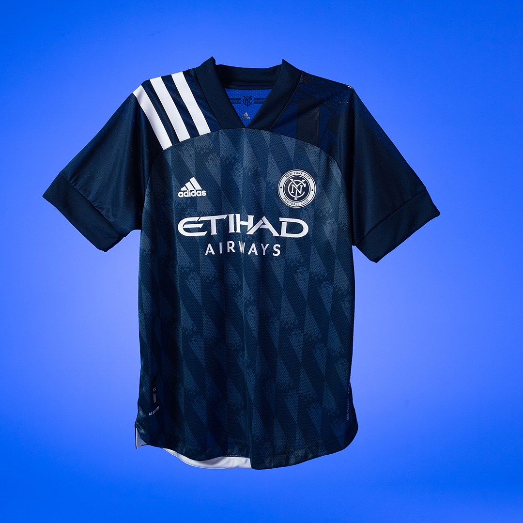
19. NYCFC
First, it’s important to note this is the away shirt. My question, is why not use orange more when you have a chance to??? Other than the thin line on the home shirt, it’s not anywhere on either kit. While not as atrocious as Columbus or Houston, the shoulders don’t do this kit any favors. Also, is it supposed to be a tight pattern like in Bayern Munich’s logo? There’s a ‘fade’ but it’s also part of the pattern, which is supposed to evoke the Brooklyn Bridge (so they say). Just a bit of a let down, to be honest.
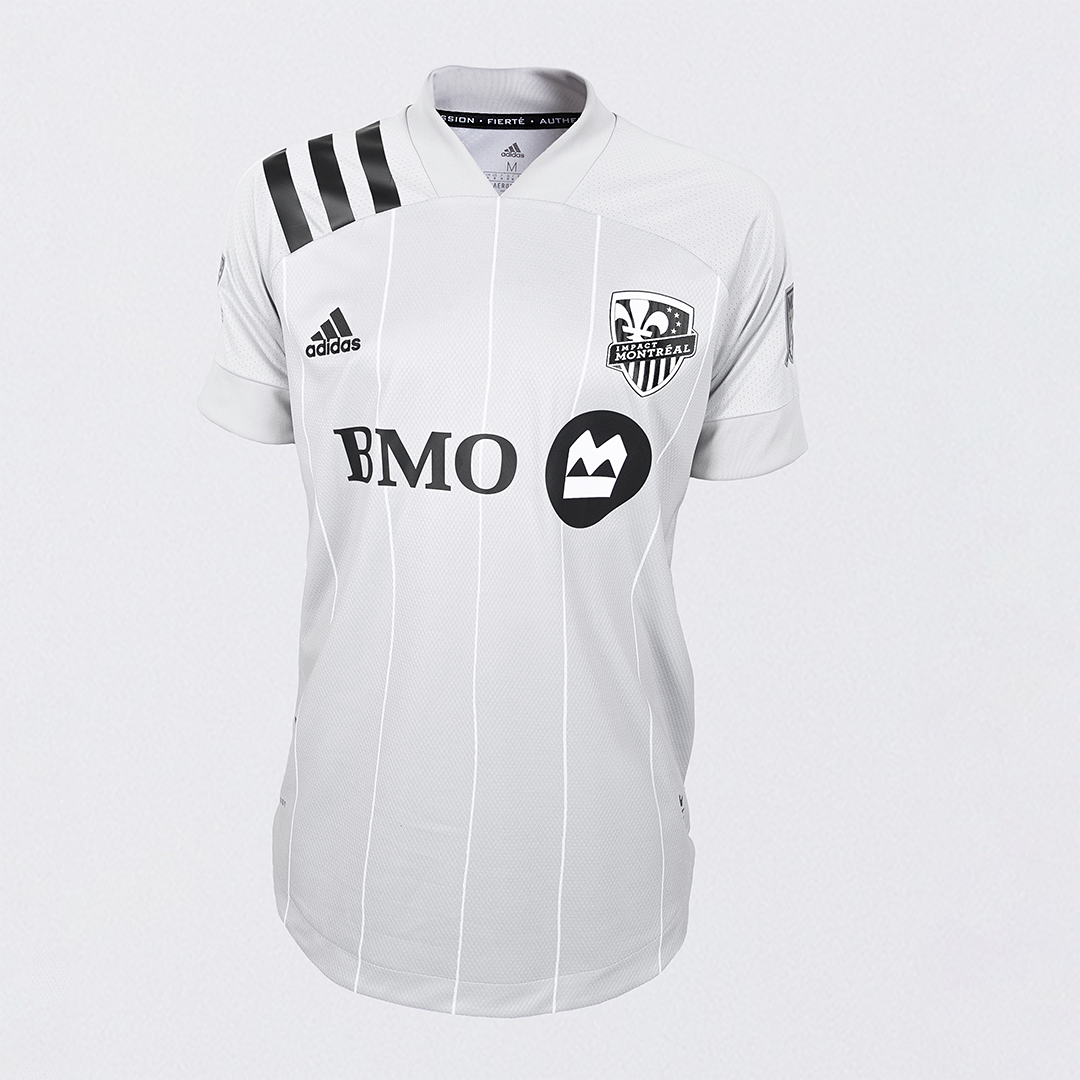
18. Montreal Impact
The good news is it’s not a white t-shirt, but it’s pretty close. It’s a cool look for a third kit (if MLS brings those back) but not including any blue makes it feel like it doesn’t belong to the club and like it was a generic shirt every club was given with only the logo and sponsor switched. It’s fine, but not the sort of thing I’d want to see my club wearing up to 17 times in a season.
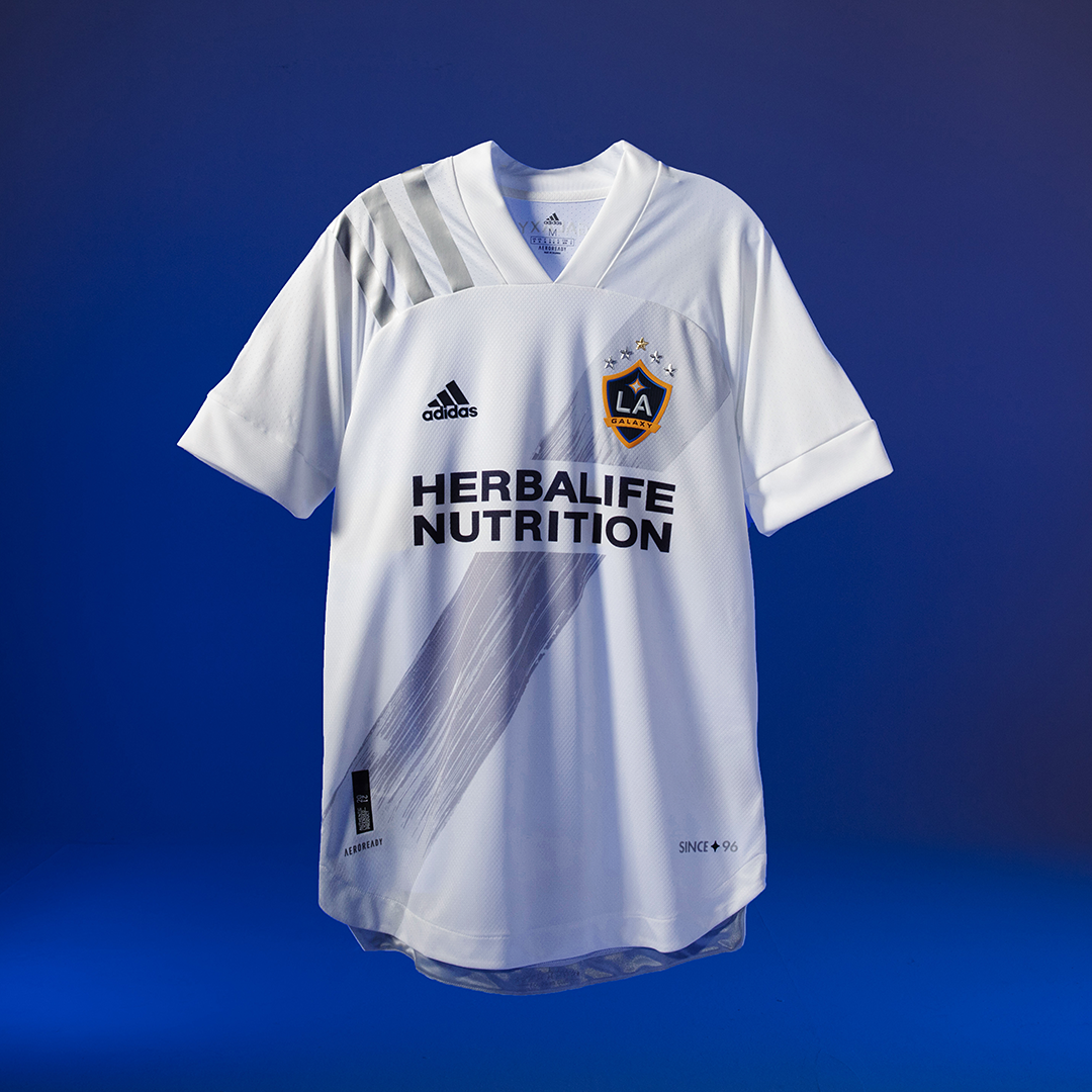
17. LA Galaxy
The “brush stroke” is one of the more unique design features of any of these shirts, and it’s cool how it fades toward the badge and shoulder. It’s a clean look, but the lack of color is weird. Silver isn’t an LA Galaxy color (unless you count the championship stars, which would be an incredibly Galaxy thing to do). Imagine if the brush stroke was navy, and the shoulder stripes were yellow? The badge being the only splash of color is just odd. It will be even stranger with numbers that are (presumably) blue.
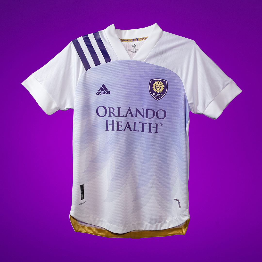
16. Orlando City
Another kit, another example of the shoulders getting in the way. That pattern fanning out from the badge just abruptly ending at an all-white area is glaring. Why not make the rest of the shirt the light purple/lavender color below the end of the pattern? White and purple should look great together. I like the idea of centering around the badge, but this is a failed attempt at something similarly audacious as the Minnesota kit.
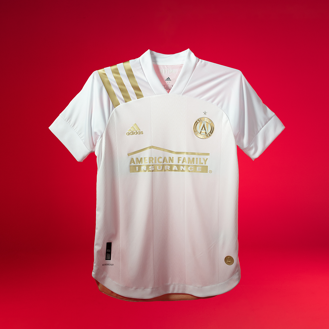
15. Atlanta United
To quote a story from Wednesday by the Athletic’s Pablo Maurer, designers don’t love gold on jerseys because it comes off looking brown. I like the white and gold but….wouldn’t this jersey be more fitting if they were defending champions? I know gold is one of the colors of the team, but the gold focus is a little much. I do like the subtle five-stripes design that comes from the home kit, but my biggest question is what color the numbers will be. They won’t be gold (I don’t think), and black will look out of place. It’s a nice shirt, though, and a nice contrast with the home. But on TV/from the crowd it’s hard to say if you’ll be able to see the gold details.
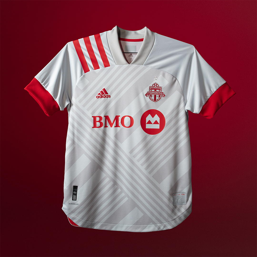
14. Toronto FC
If you’re gonna do white, it needs to be interesting. The design is subtle enough to be unique but not so bold as to clash with the white of the rest of the shirt. The red is used enough to mix things up, and the shoulder stripes don’t get in the way. My question is what this unique design has to do with Toronto? Most of the stripes are going on way then there’s a big one going the other way? It’s supposed to represent the city’s many cultures? It’s better than Montreal, but what’s with all the white Canada? Snow?
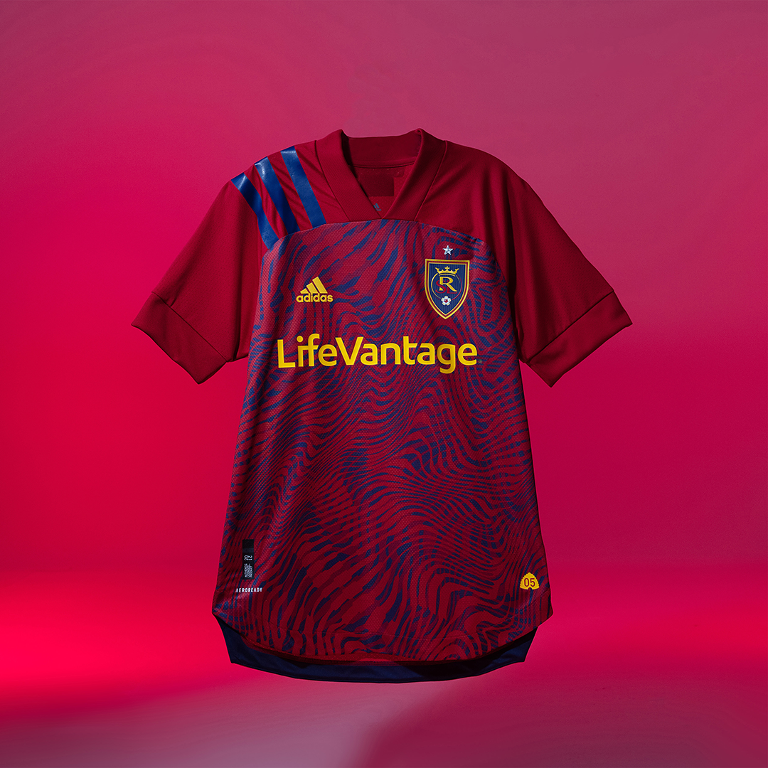
13. Real Salt Lake
A better version of the Houston design that still looks odd having the design stop at the shoulders. RSL has great colors, and having the sponsor be yellow is a great call. I might have had the shoulder stripes be yellow as well. Hopefully the topographical map design itself is cool enough to distract from the other stuff.
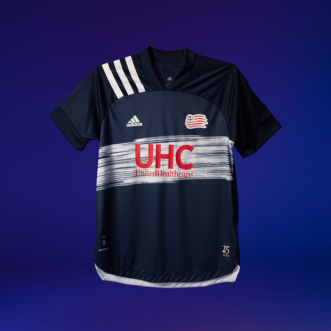
12. New England Revolution
Is this the same “brush stroke” idea as the Galaxy shirt? Other than that, it’s just plain navy blue shirt. The stripes are white, the name and number will be white. I like the way the sponsor combos with the brush stroke, but other than that this just looks like every other Revolution jersey. The one thing I am excited about? Red shorts!

11. DC United
The one kit that actually somewhat resembles a 1996 edition (given that most of those kits were ridiculous), this is a pretty familiar looking DC jersey. Again per the Athletic’s Pablo Maurer, there are questions over what color the shorts will be. If they’re red, this will be a phenomenal throwback look. If they’re black, it’s a fine jersey but nothing to write home about.

10. LAFC
This is...really plain? Not that they have a lot of leeway with this kit. I’m glad they didn’t mess with something that works. The subtle vertical stripes are about the most they can do. I’m surprised the Adidas stripes on the shoulder aren’t gold, but gold numbers on the back look awesome. Sometimes it pays to just keep it simple
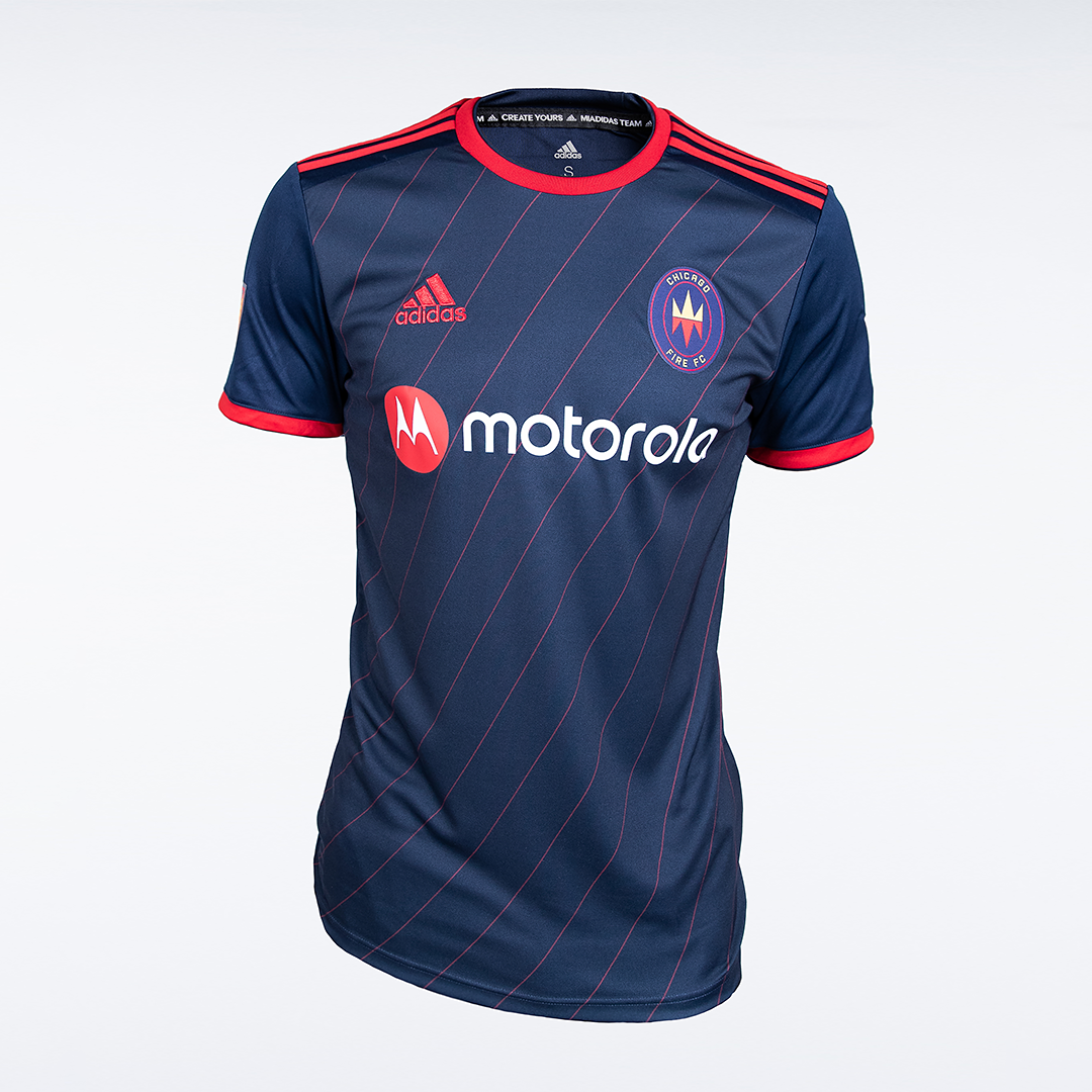
9. Chicago Fire
No team had more creative license than the Fire with their rebrand. The departure from being “The Men in Red” will certainly take some getting used to, but I think this is a really good jersey. The traditional red pinstripes and stripes on the shoulder play great off the blue. The logo still looks out of place here, given that the dark blues don’t match (old logo would look awesome on these, but I digress...). The Fire do not have the three diagonal stripes, as the Fire’s rebrand was announced long after Adidas began working on the 25th anniversary kits. If this was the product of a last-minute time frame then the club and Adidas have done pretty well.

8. FC Dallas
It’s a nice shirt! A better job of the shrinking stripes than Man United had last year, the stripes look good, the team’s colors are well balanced. White or Blue numbers would work well on the back. Not much to comment on, but no complaints.

7. Vancouver Whitecaps
The Whitecaps often low-key have some of the best MLS kits (I’m a big fan of their current home kit). This is like a less atrocious version of Seattle. I like the idea of waves (punny, but I’ll allow it). If you’re going to explain how a design relates to the city, don’t make it some jargony thing nobody actually says about the team/city. This shirt connects the team, and although the pattern and shoulder stripes don’t really go together it will still look good.

6. San Jose Earthquakes
I like when teams do something different. I like that they tried to take the shoulder and turn it into a feature of the design. That said...all I see is a Visa card. Yellow isn’t really an Earthquakes color, although it looks good (it represents the city flag). The fact that the yellow is nowhere else is kind of strange. I really want to like this shirt even more, but the shoulder stripes just clash with the yellow and blue design on the front. It’s halfway between beautiful and weird, so actually not bad at all!
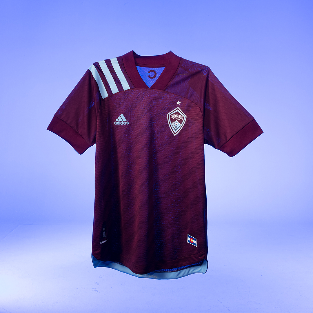
5. Colorado Rapids
The Rapids rebrand several years ago may be the best in MLS history. Their colors lend themselves well to good kits, which is no different here. The Adidas stripes offer a great opportunity to use the light blue, and honestly the shirt would be worse-off without them. I’m also a big fans of designs other than a plain shirt that don’t get in the way of anything else. My only request: bring back the state flag away kits.

4. Sporting Kansas City
I may not like the front/shoulder discontinuity that many of these jerseys have but this is much better from SKC. I like how the badge, Adidas stripes, and sponsor are all the same color. I also like the subtle polka-dot design. Yes, I’d prefer it to be on the whole jersey given that every one has that I guess I can’t get too upset about it. Great shirt.
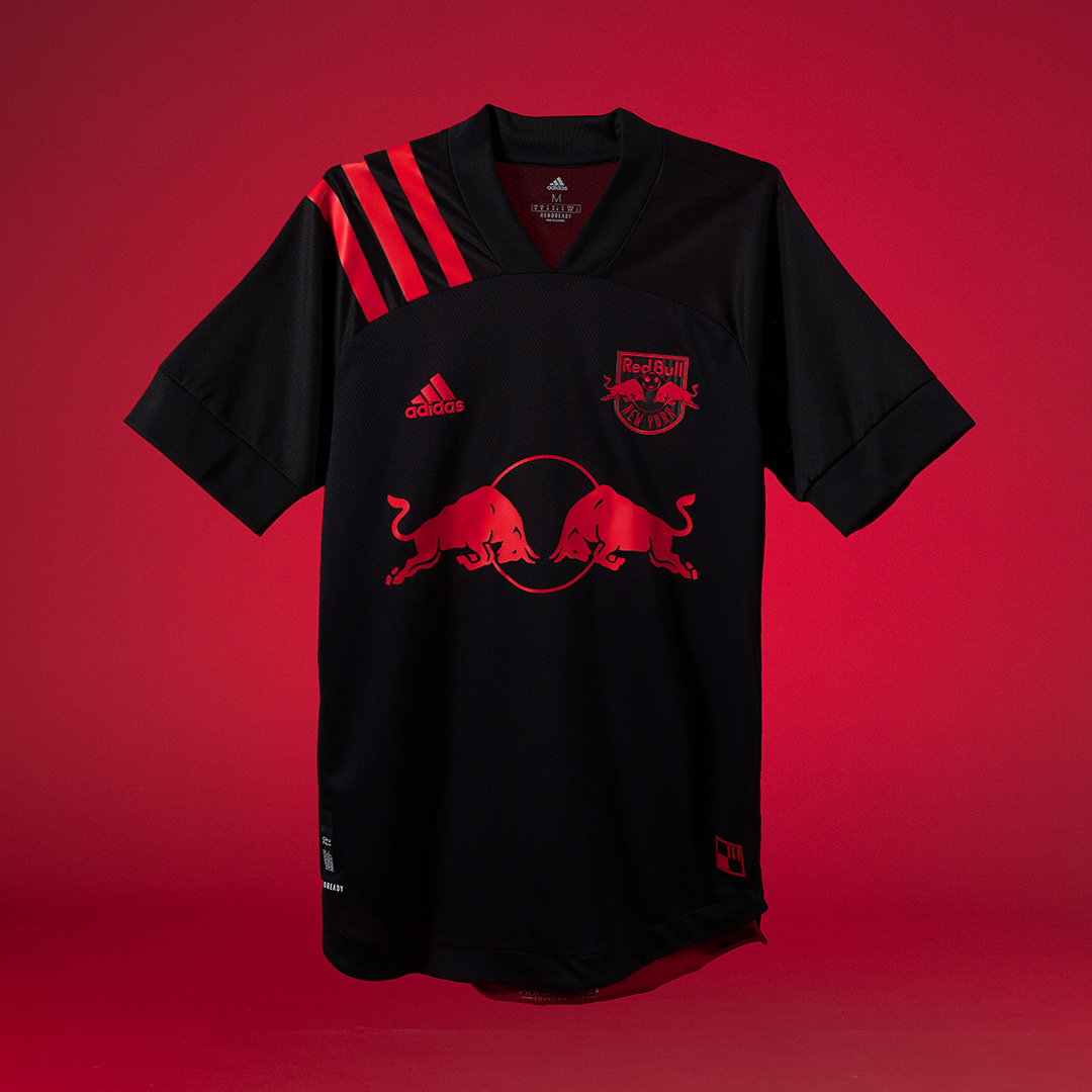
3. New York Red Bulls
Say what you will about Red Bull’s involvement in soccer, but that logo looks awesome like this on a jersey. This is what you want out of an away shirt: something totally different than the home that really jumps out. Given their current home shirt isn’t primarily red, this is the perfect time for a black kit. Also, it’s a great New York kit given that this would look good just to wear in a non-soccer context.
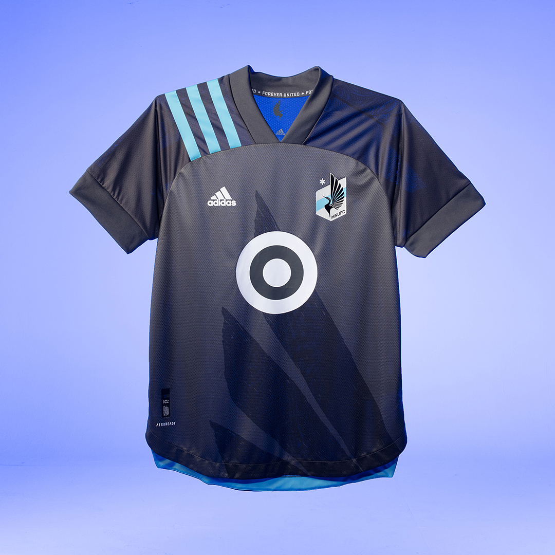
2. Minnesota United
Slam dunk. Out of the park. Awesome. Brining back the wing design from the club’s NASL days is genius. It doesn’t get in the way, the Target logo is still the coolest shirt sponsor in MLS, the blue in the stripes and on the bottom plays great with the grey. The shoulders, while different, match the wing so the color shift feels like it makes sense. This thing is great.
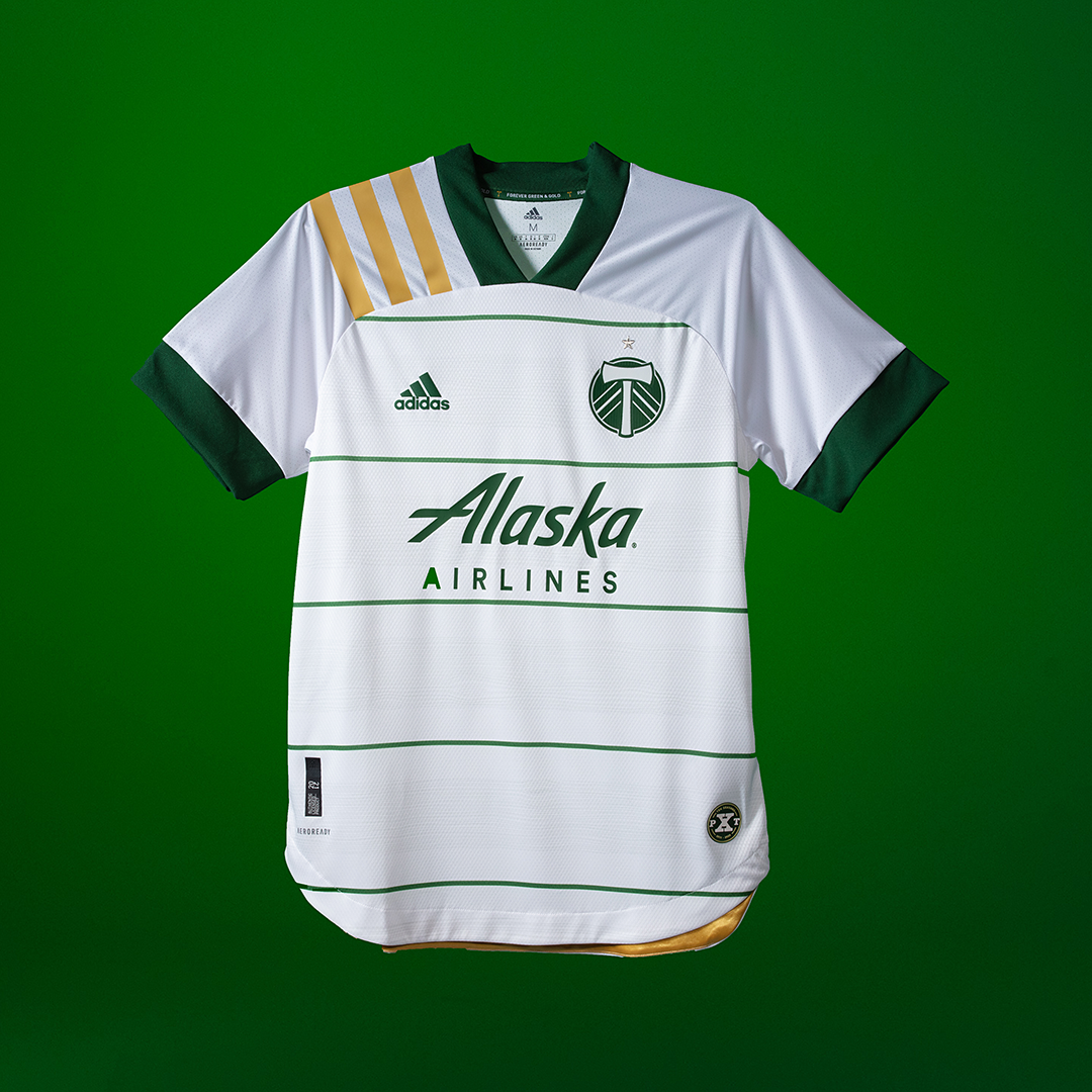
1. Portland Timbers
Damnit, they’ve done it again. This thing is BEAUTIFUL. This is how you do a white jersey. It makes it even more confusing how any teams end up with plain, white t-shirts. Having maybe the best badge and best sponsor (in terms of coordination with club colors), along with a unique color scheme, definitely helps.